Every few years I get the chance to set a batch of poetry by hand to print using letterpress. It’s a different thing to my usual piecework setting individual lines for titles or colophons. It’s also a completely different thing to typing anything on a computer.
Have you ever stopped to think how many words we can write daily without effort? With computers, word production is almost inexhaustible. Churn out the letters, wipe them out if they’re not working, print them out as many times as you like.
Old-fashioned letterpress (as opposed to linotype or monotype) is set letter by letter, side by side, line by line. It is a slower process than handwriting, but they are closely connected in relation to keyboarding.
Advertisement
The personal effort made when writing legibly by hand closely connects the writer to the page, to the words, to the intention behind the words. The process is slow enough to allow the writer to consider very carefully the next word, the next line. I don’t think computer keyboarding allows this to the same extent, although as I’m not a professional writer I’m not really qualified to make such a generalisation. But look at how much superfluous text is being generated out there, if only in blogosphere!
When I set a poem by hand, I think about these things. I can’t think with too much absorption, otherwise I will set the wrong word. It’s a bit like driving a car across the Nullabor plain: you can see a truck coming for hours, but if you don’t concentrate, you’ll still hit the bugger head-on when it finally comes close, even though there’s nothing else around for kilometres. You can know the line of text you’re setting off by heart, but if your mind wanders, typos creep in. But … the mind always seems to wander.
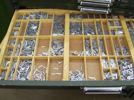
In Australia, we have very few letterpress resources. There are no foundries anymore, casting fresh metal letters (or none that I know of, please tell me if you know of any); if you’re keen enough, you can have fresh type shipped over from the US or the UK, but they sell it by weight, and it’s heavy stuff. Consequently a lot of what is here is quite worn.
To set my book of poems (I’m working on a selection by Nan McDonald), I am using what was, when I started, a reasonably full case of Bodoni 12pt roman. Enough to print 14 poems, but only if I set four pages at once, then pull them apart and set the next four pages. My first page printed was a shock. This is a case of type that has been used by students and staff in an arts institution for many years, and at a technical college for years before that. Consequently many of the letters are very worn (giving them a “thick” look when inked) or chipped.
I started to make a box of this worn type as I substituted it for letters in better shape, and keeping it separate as I dissed the type back into the tray. I’m now almost halfway through the printing of the book’s text, and each page looks better at the first pull.
Advertisement
Some letters wear faster than others. Anything with a serif on an ascender or descender is in danger: b, d, k, l, p, y. Pointy letters: w, m. Dotty letters: i, j. And the letter r is becoming particularly scarce. Some letters get recycled so often that they become friends. I have a particularly sharp r that I put aside as I diss to use in prominent words in each poem. And yet I have an overflowing compartment of the letter c, most of them new. The problem is, I can’t use the new ones because they look strange next to all the worn letters. Luckily the thickness of the paper I’m using (280gsm) allows the different height of the worn type to be accommodated. I’m letting it bite ever so slightly into the paper, without “show through” on the other side.
I don’t want my pages to be perfect. I’m happy with the slightly uneven look I’m achieving; otherwise I might as well just print this book from an inkjet printer. However, when I say “prominent” words I mean that. As you read a poem, there are times when a words leaps out at you, and in this case it’s for all the wrong reasons. You want the type to be invisible in a way, to let the meaning of the words exist independently. If a word is leaping out at you because it’s thick, dull and broken, it’s unfair to the reader.
Discuss in our Forums
See what other readers are saying about this article!
Click here to read & post comments.
2 posts so far.

 reddit this
 Seed Newsvine
 StumbleUpon