The maps below show Federal Election primary vote results by booth, based on Electoral Commission data, and reported by The Sydney Morning Herald. The red dots are where Labor polled the most primary votes, the green are for greens, blue for Liberals, and grey for Independents (left leaning Teals in Sydney). The colours show the party with the largest primary vote – they do not take into account preferences or seat wins/losses.
I am just showing Brisbane, Sydney and Melbourne – which combined account for two thirds of the Australian population. If you can’t win here, you can’t win.
Advertisement
(Above) The clustering of green votes in inner city booths of Brisbane closely aligns with the highest income areas of the city. Labor dominated across most suburbs.
(Above) A wider view of South East Queensland shows the greens strength is confined to inner Brisbane, and does not extend to the Gold or Sunshine Coasts. Just south of here however is Northern NSW – a very strong green voting area (and a very wealthy one also). Liberals won the primary vote counts in Gold and Sunshine Coasts which are arguably more likely to house retirees or working boomers. This map covers a population of around 4 million – 15% of the entire country.
Advertisement
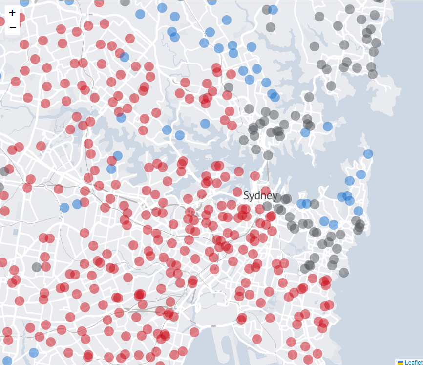
(Above) In Sydney, the independent/Teals votes are strongest in the wealthiest inner-city areas around the harbour. Labor did well everywhere else.
(Above) A wider view of Sydney, where Labor dominated the suburbs. This map covers roughly 5 million people – or around 20% (one in five) of all people in Australia.
Discuss in our Forums
See what other readers are saying about this article!
Click here to read & post comments.
1 post so far.


 reddit this
 Seed Newsvine
 StumbleUpon