With the Federal Government considering ways of forcing organisations to reduce carbon emissions, the problem of reducing carbon dioxide in the atmosphere is not nearly as difficult as it is generally believed to be. For there is much less of it there than forecast in the first place, although no one seems to be have realised this.
As readers will recall at the Copenhagen conference in December, and elsewhere, various prominent personalities declared that carbon emissions were running at the top of projections. But how do they know this? The pronouncements never cited any sources or reasoning. Instead, the point was simply stated and accepted at face value, without the parties involved realising that the records that can be examined show exactly the opposite, as we shall see.
When climate modellers started making dire forecasts about future temperatures in the late 1980s they looked at the undoubted increase in carbon dioxide in the atmosphere in the preceding decades and leapt to the conclusion that concentrations would double during the course of this century. That was a big leap, but that supposed doubling became an accepted figure, with various experiments to test the reactions of sea creatures to future environmental conditions using much higher concentrations.
Advertisement
To give the projected doubling more substance, in the late 1990s the Intergovernmental Panel on Climate Change set some economists to work on projections for industrial emissions, a task which proved to be considerably more complicated than the panel had previously suspected. For to make useful estimates of the increase of the two main greenhouse gases, carbon dioxide and methane, in the atmosphere the economists first had to estimate increases in economic activity over the next 10, 20, 50 years and more. In addition, the economists had to take into account changes in population and energy intensity (the amount of energy used in generating economic activity).
That was all bad enough but the really tricky part was comparing the sizes of different economies. The easiest way to do this is to simply convert everything into American dollars, so the Chinese economy would be compared to the American economy by converting the total GNP of China in Yuan to US dollars. Then if you know something about emission intensity you can say something useful about total emissions generated by the two countries.
The problem is that the Market Exchange Rate (MER) approach of comparing economic size is known to produce wrong answers due to vagaries in the exchange rates. In particular, it is known to greatly under-estimate economic activity in developing countries which usually have weaker exchange rates. Instead, economists use Purchasing Power Parity, which is a lot more difficult. One way of looking at this, which isn’t quite right but will do as an explanation, is how far will a dollar stretch in New York, as opposed to a Yuan in Beijing; or for how long someone earning the average wage in either country will have to labour to buy a set basket of goods. The magazine The Economist occasionally publishes a big mac index by calculating how long the average wage earner in each country has to labour to buy a big mac, given that McDonalds strives to makes it product consistent worldwide. Economists most emphatically do not rely on the big mac index but that illustration should give you an idea of what is meant by PPP.
The IPCC went through the exercise of working out just what the world economy will be doing over the next century, to produce a host of emission scenarios using different values for the variables mentioned above, packaged into a Special Report on Emission Scenarios (SRES) issued in 2000. Its available on the IPCC website. Unfortunately, the IPCC economists used MER analysis to compare economies instead of PPP, an approach which sparked a row between the panel and two distinguished Australian economists, Ian Castles and David Henderson.
The now late Ian Castles was a former Australian Chief Statistician and David Henderson was formerly head of the economic and statistics department at the OECD. Their objections found favour with other economists (although very few seemed to be have looked at the issue) but the IPCC labelled the campaign as “disinformation” in a press release. In chapter three of the the 2007 report the IPCC agrees that PPP should be used where practical, but says the relevent data is not available for a number of the economies in the forecast. In any case, the panel’s economists did not think the end result would be any different.
Henderson has since stated loudly and publically that the end result of the IPCC approach was to wildly overstate the emission growth in high economic growth scenarios. As noted, the MER approach makes the economies of developing economies appear smaller, but some of the IPCC scenarios have those emerging economies growing to be on a par with the US economy per capita, with correspondingly stronger exchange rates. In other words the economies of those countries are set up to be small at the beginning of the scenarios and very rich at the end, with corresponding increases in emissions.
Advertisement
The IPCC approach has its defenders but as the emission scenarios were released 10 years ago it is possible to cut through much of the argument by comparing the scenarios with actual data, albeit with yet another complication. The forecast emissions are in gigatonnes of carbon dioxide equivalent, which have to be converted into the expected concentrations in the atmosphere expressed in parts per million for CO2 and in parts for billion for methane, which means we have to know something about how long those gases hang around in the atmosphere. Let us wave away those complications and skip to the final projections for concentrations given in a table appended to the 2007 IPCC report.
The lowest projection for methane for 2010 is 1,839 parts per billion (the forecast is given in 10-year increments), and the highest is for nearly 2000. But the actual result for mid 2010 is about 1,790. In other words, just 10 years out, the projections for methane are hopelessly wrong. The panel’s economists used very sophisticated analytical techniques and economic modelling but, in essence, they forecast that the increase in methane concentrations evident in the decades before 2000 would continue and even increase. Instead the growth in methane concentrations stopped; no one knows why.
The 2007 IPCC report discusses this point in detail but does not offer a useful conclusion. The results for methane can be seen in the graph cribbed from the site of the National Oceanic and Atmospheric Administration (NOAA), a part of the US Department of Commerce.
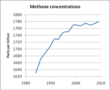
Increase in Methane concentrations in the atmosphere levelled off around the turn of the century. No one knows why. Source: NOAA.
The forecasts for CO2 concentrations are better, but still short of the horror story the IPCC wants to sell. CO2 concentrations in mid-2010 are about 388 parts per million (0.0388 per cent of air), as can be seen from the second graph, which is a little ahead of the lowest IPCC projections of 381ppm. But the mid range projections are mostly above 390ppm and the highest is nearly 400ppm. Again the top-range of the panel forecast supposed, in effect, that a slight acceleration in rate of increase of CO2 levels evident in the years before 2000 would not only continue, but increase. Instead that acceleration died away, with the increase levelling off to around 2ppm a year. You can see change in the rate of annual increases in CO2 in the third graph constructed from figures on the Mauna Loa site.

CO2 trends moving up, but not as fast as the IPCC forecast. Source: NOAA.
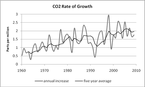
Annual increase in CO2 concentrations as measured at the Mauna Loa station. The average annual change has shown only a very modest increase for more than a decade.
One answer from the panel to all this wearying criticism is to point to what amounts to a carbon dioxide hockey stick. Look how much CO2 has increased since pre-industrial times? A great deal could also be said about that assertion but the real problem is trying to forecast, accurately, what will happen rather than what scientists think has happened in the past. As we have seen, as far as methane is concerned, this is now impossible as scientists have confessed they have no idea what is going on with the gas.
As for CO2, simple arithmetic shows that an increase of 2 parts per million a year over a century is 200ppm, or a touch more than 50 per cent of present concentrations, not double. During all of this industrial emissions have undoubtedly increased, mainly thanks to China which is reportedly building more capacity than the entire Australian electricity generating network in coal fired power stations every year. But that vast increase in emissions has been occuring for many years and should be evident in the existing concentrations. So where is the supposed acceleration in the increase in concentrations?
Activists may also say that 2ppm per year is too much and they may be right, for all I know, but before we start talking seriously about cuts it would be nice to know just how much industry is supposed to cut, given that the existing projections are short somewhere along the line. My impression from the Copenhagen Conference is that the cuts suggested, but never agreed to, were based on the top range IPCC forecasts.
But then the IPCC has not helped matters by entirely ignoring the problem. They have made no attempt to communicate the good news of the methane concentrations, and do not seem to have made any plan to issue revised projections. The panel seems quite happy with the projections the way they are. The real question is, then, what projections are the busy climate modelling community using for their all-important climate models?
Never short of an argument activists may respond that the present rate of increase can still accelerate, to put CO2 concentrations back up near the top end (this would require major changes). In any case what should one drop of real world data count against several bucketfuls of computer simulation done by highly-qualified people? Perhaps, although given the success rate of the computer modelers to date it would seem just as likely that the rate of increase may slow down or even go backwards. But with the science of global warming settled and certain, how could that happen?

 reddit this
 Seed Newsvine
 StumbleUpon